Page to Pillow
A wellness app that helps users wind down for sleep through personalized reading experiences. Combining smart sleep scheduling with curated book recommendations to help people with insomnia, busy schedules, and anyone who loves bedtime reading.
Overview
In today's fast-paced world, many people struggle to fall asleep due to stress, anxiety, and excessive screen time before bed. While reading is a proven method to wind down, finding the right books and carving out time for reading remains a challenge.
Page to Pillow bridges this gap by creating a dedicated space for bedtime reading. The app intelligently calculates optimal wind-down times based on users' schedules and sleep goals, while offering personalized book recommendations that match their preferences.
Research & Discovery
Our research journey began with existing sleep scheduling apps, but we quickly realized this space was already saturated with solutions like Sleepytime and Rise. We pivoted to explore wind-down apps like BetterSleep, Calm, and Noisli, which focus on meditation and ambient sounds.
However, our research revealed a critical insight: reading is the most effective research-backed method for winding down before bed. Unlike scrolling social media or watching videos, which increase brain activity, reading physically slows you down and improves sleep quality.
This presented our opportunity: the market had plenty of meditation apps and sleep calculators, but nothing that specifically addressed reading as a wind-down tool. By combining sleep scheduling with reading discovery, we could address two problems simultaneously, helping users both find time to read and improve their sleep quality.
46% of U.S. adults didn't read a book in 2023, with "lack of time" as the primary reason. By integrating reading into bedtime routines, Page to Pillow helps users discover they actually do have time, while simultaneously improving their sleep quality.
Source: YouGov Survey, 2023
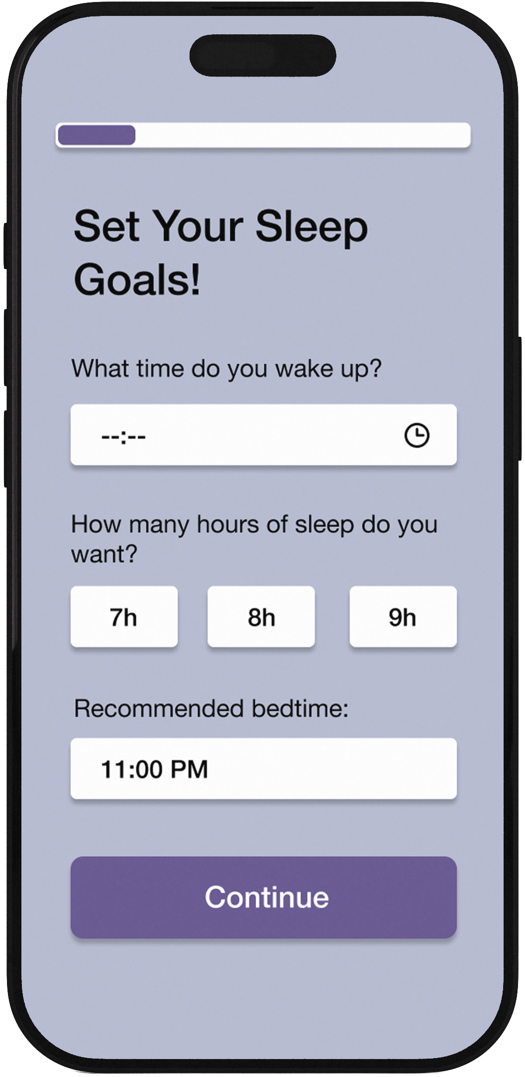
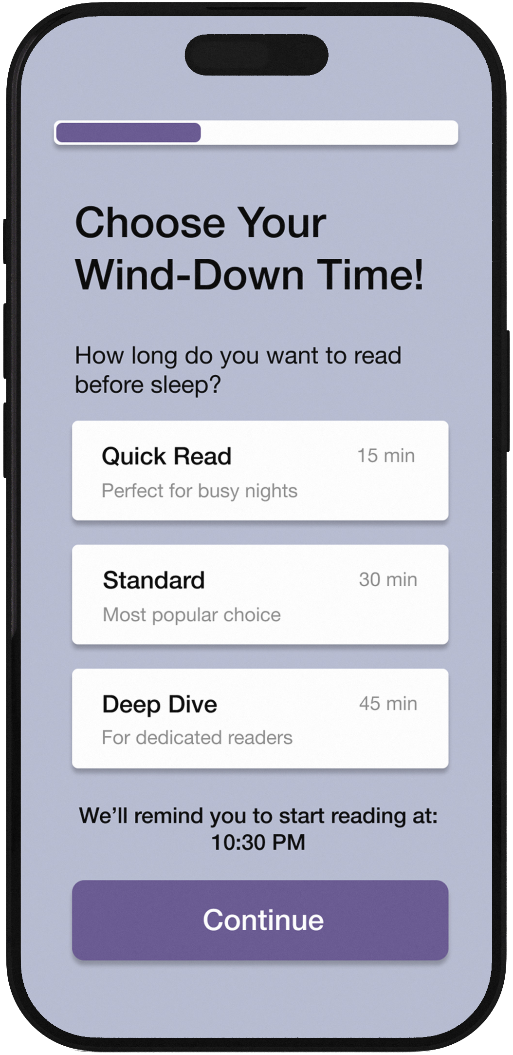
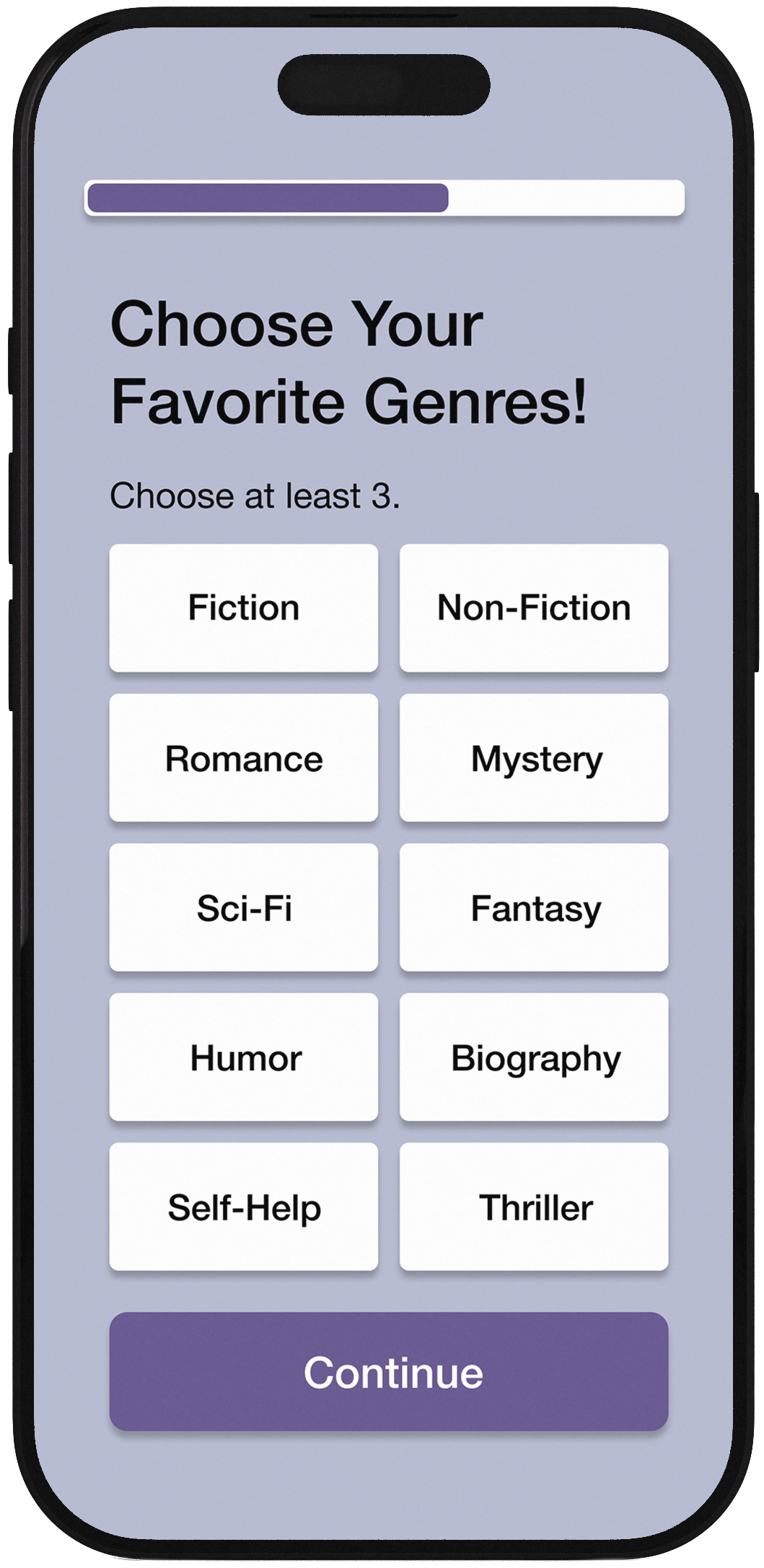
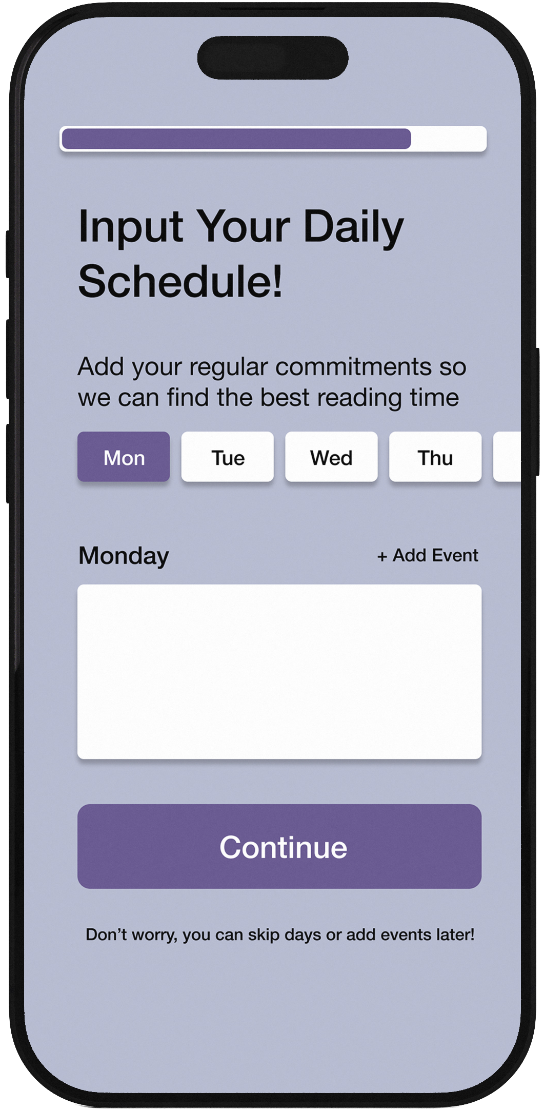
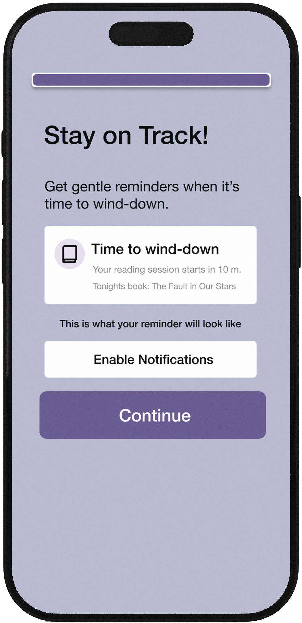
Onboarding Flow
Users input their schedule, sleep goals, and reading preferences to personalize their experience
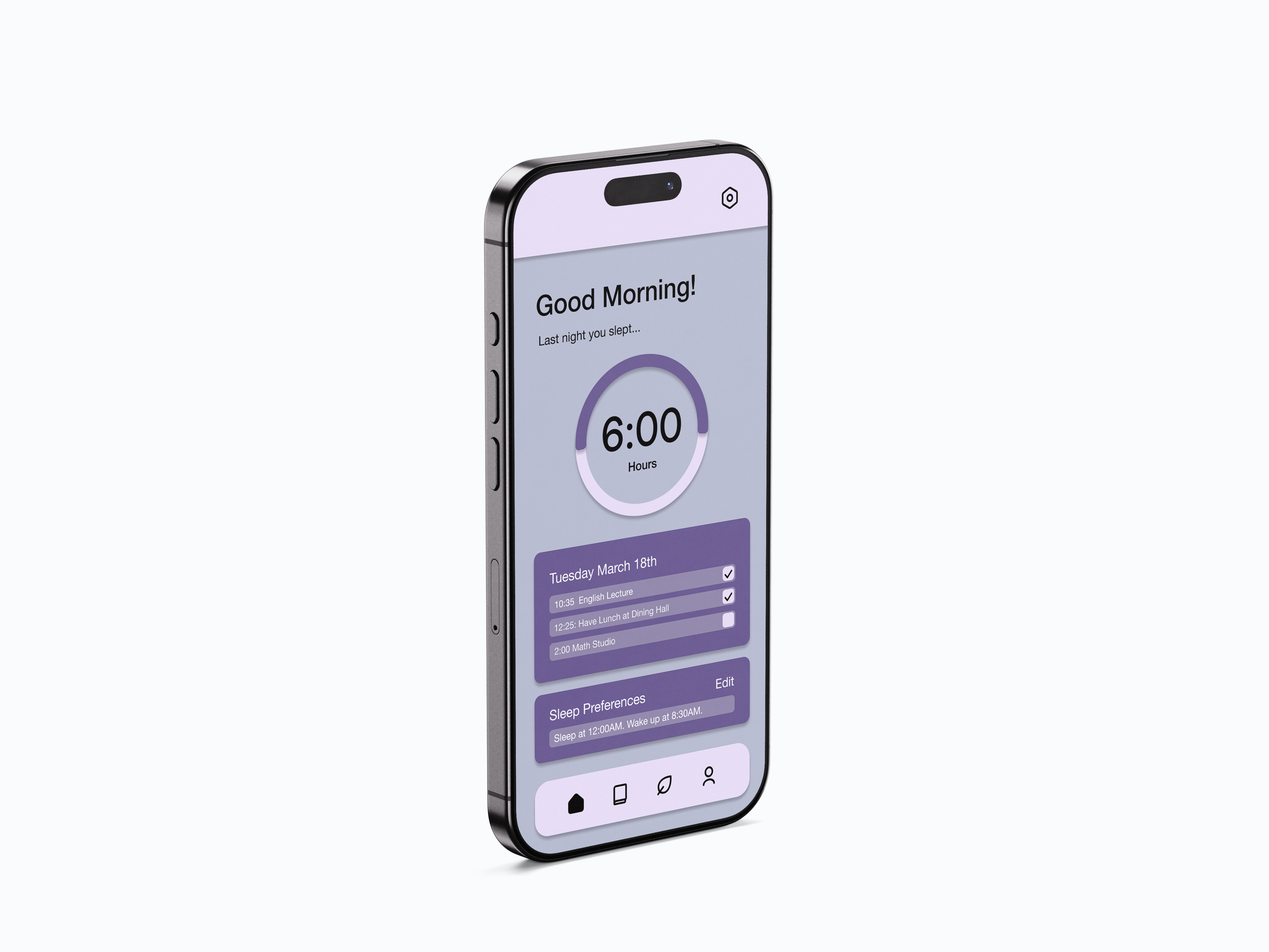
Home
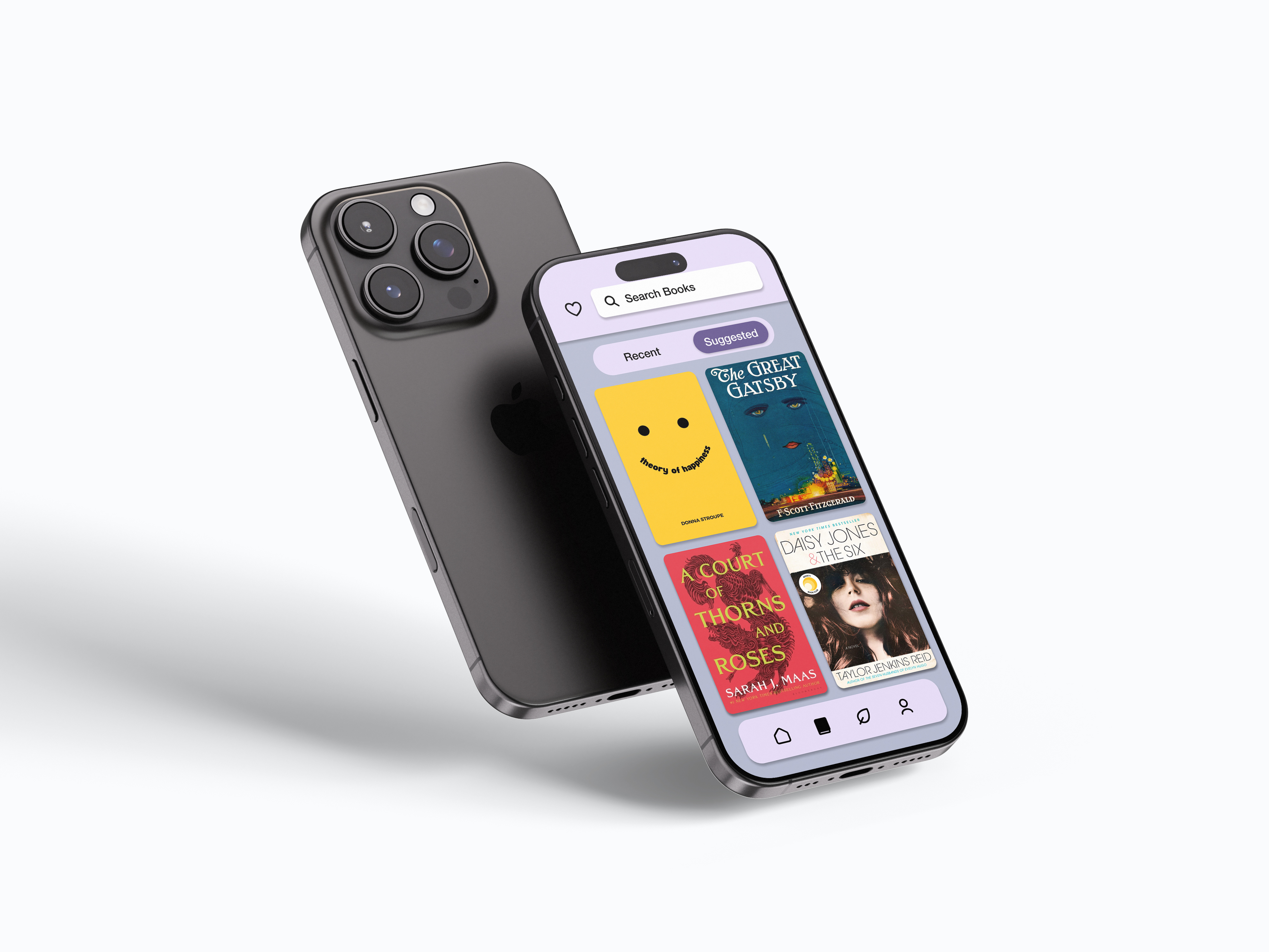
Books
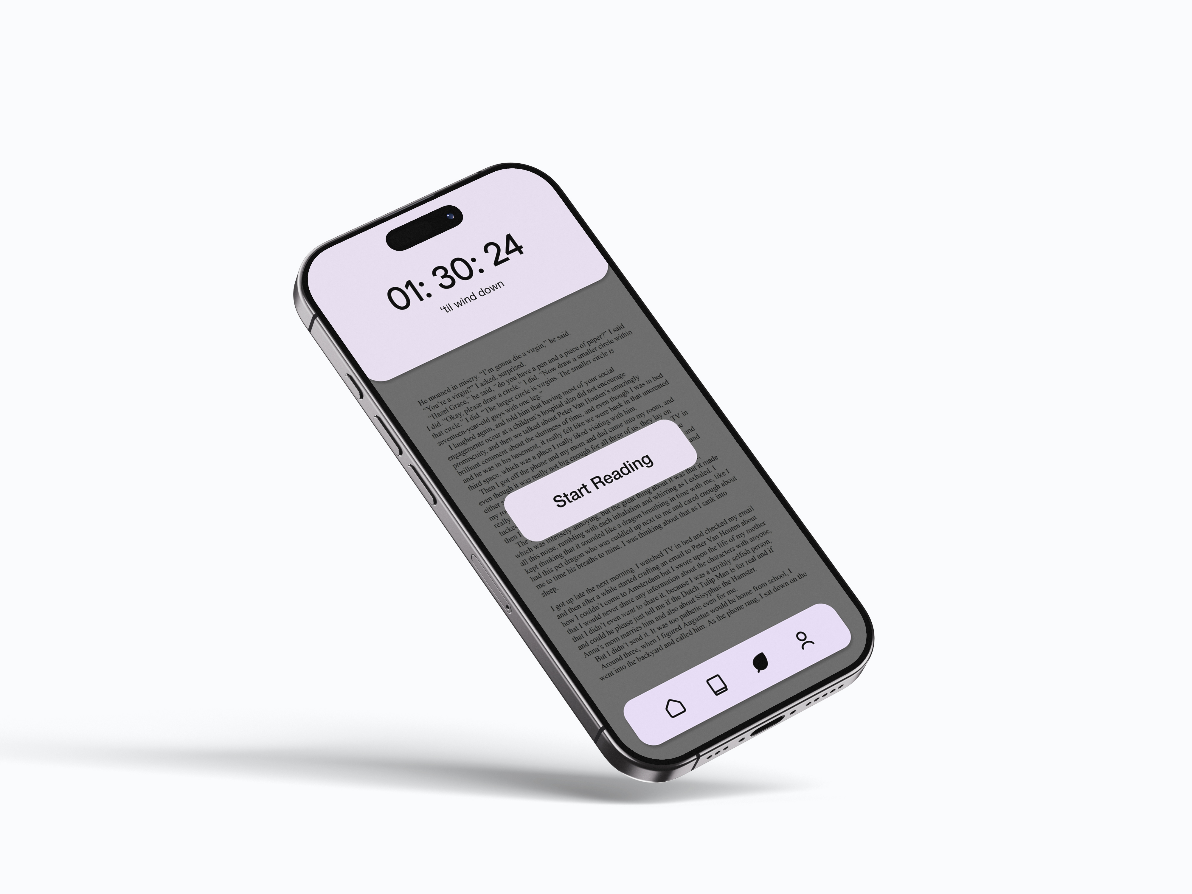
Wind-Down
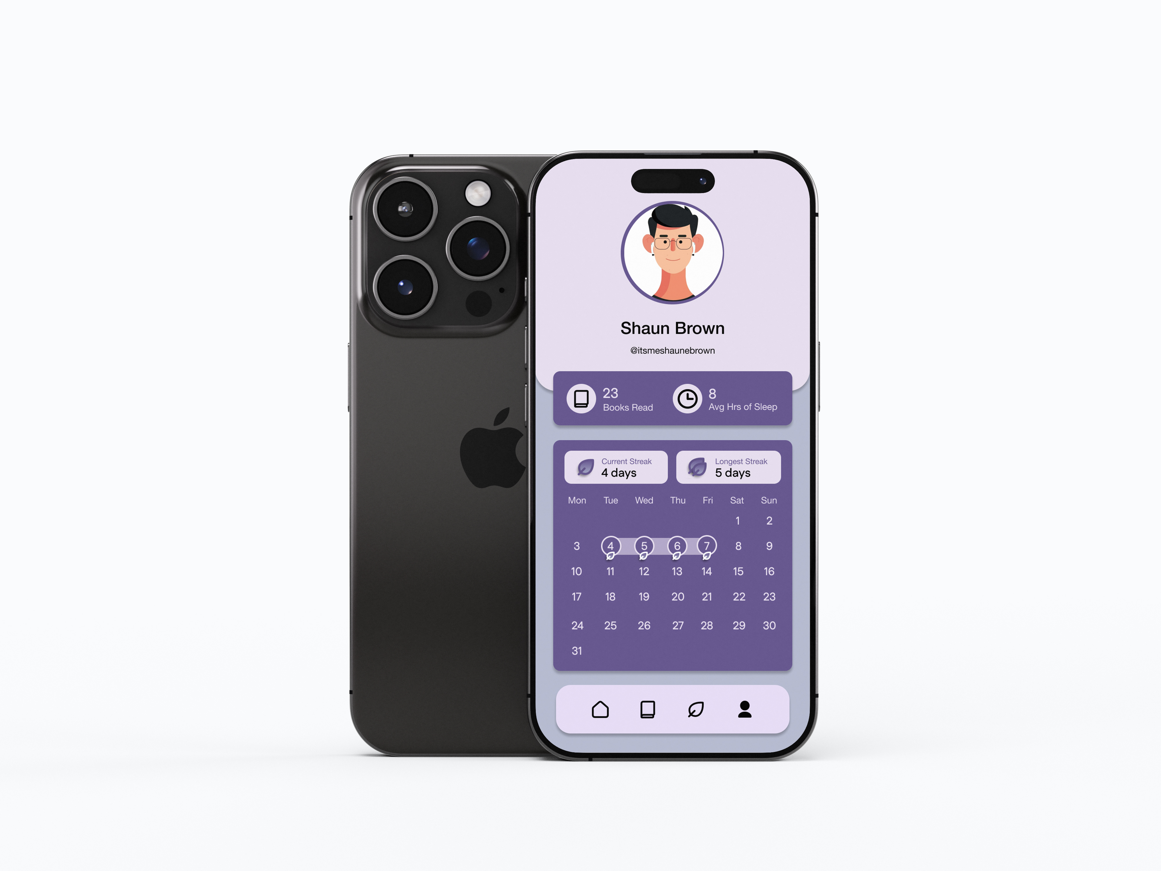
Profile
Calming color palette optimized for nighttime use