 Multivariate Test (MVT) Admin
 Multivariate Test (MVT) Admin
A powerful testing tool that nobody could read at a glance.
As a UX Design Intern at CarGurus, I worked on the internal platform teams use to run A/B and multivariate tests. The old workflow had five statuses (Created, Initialized, Active, Inactive, Archived), and treated a test's entire life as one long "Active" phase. A test running at 1% of traffic looked identical, status-wise, to one fully ramped and being watched for real results.
All test names and data are recreated for this case study to protect confidential information.
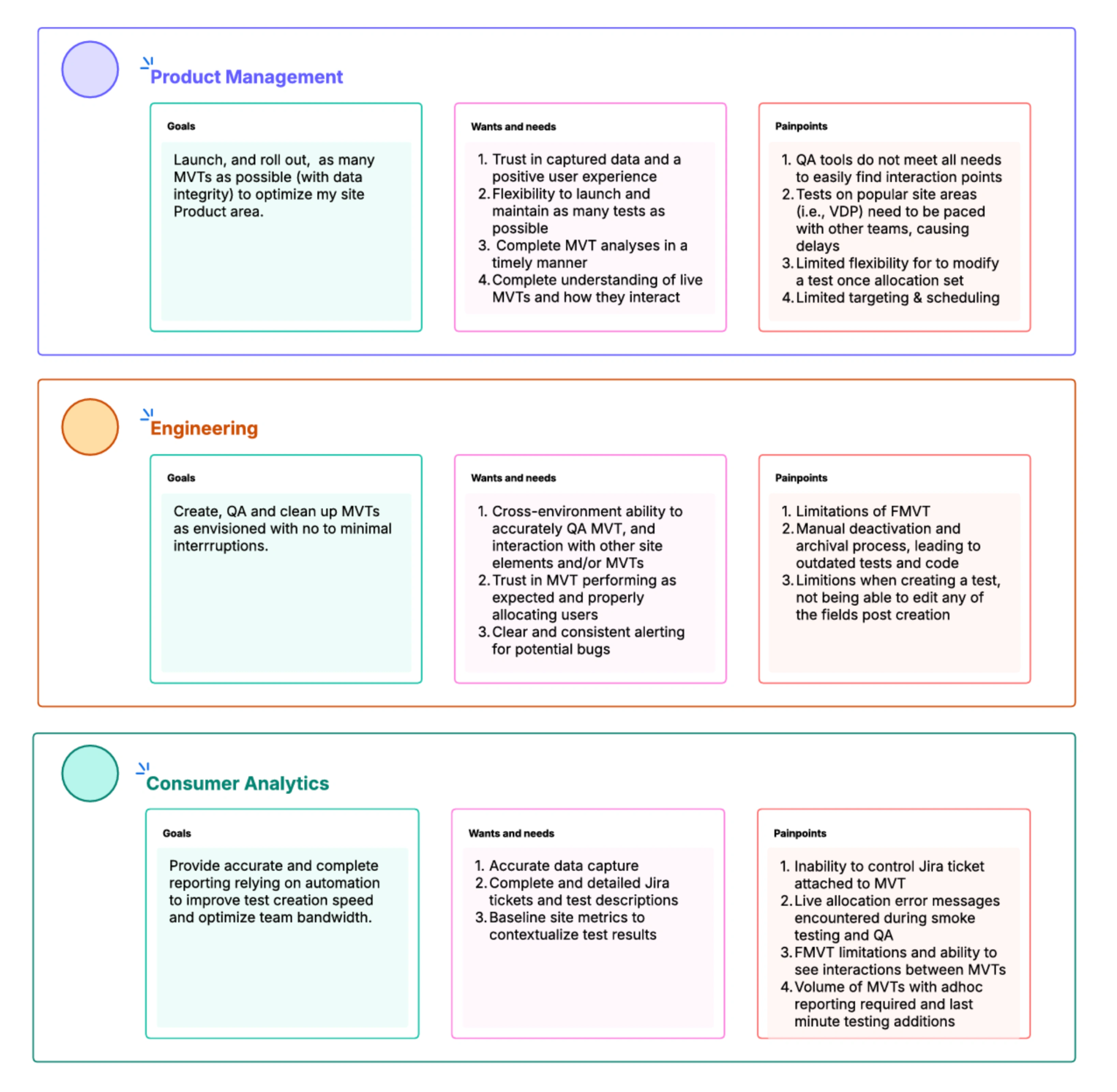
I started by mapping the responsibilities and pain points of the tool's three power users, PMs, analysts, and engineers, then traced where each role enters and exits a test's lifecycle. That made it clear the existing status list didn't match how any of them actually worked.
To pressure-test that mapping, I workshopped several workflow iterations with stakeholders from all three groups, then ran one-on-one interviews for more candid feedback than a workshop setting allows. Both fed directly into the final workflow.
For those workshops, I used AI to turn my static Figma frames into a clickable prototype instead of building every micro-interaction by hand. That let stakeholders click through something that felt real instead of talking through static screens, so I could watch where the flow broke down and iterate faster between sessions.
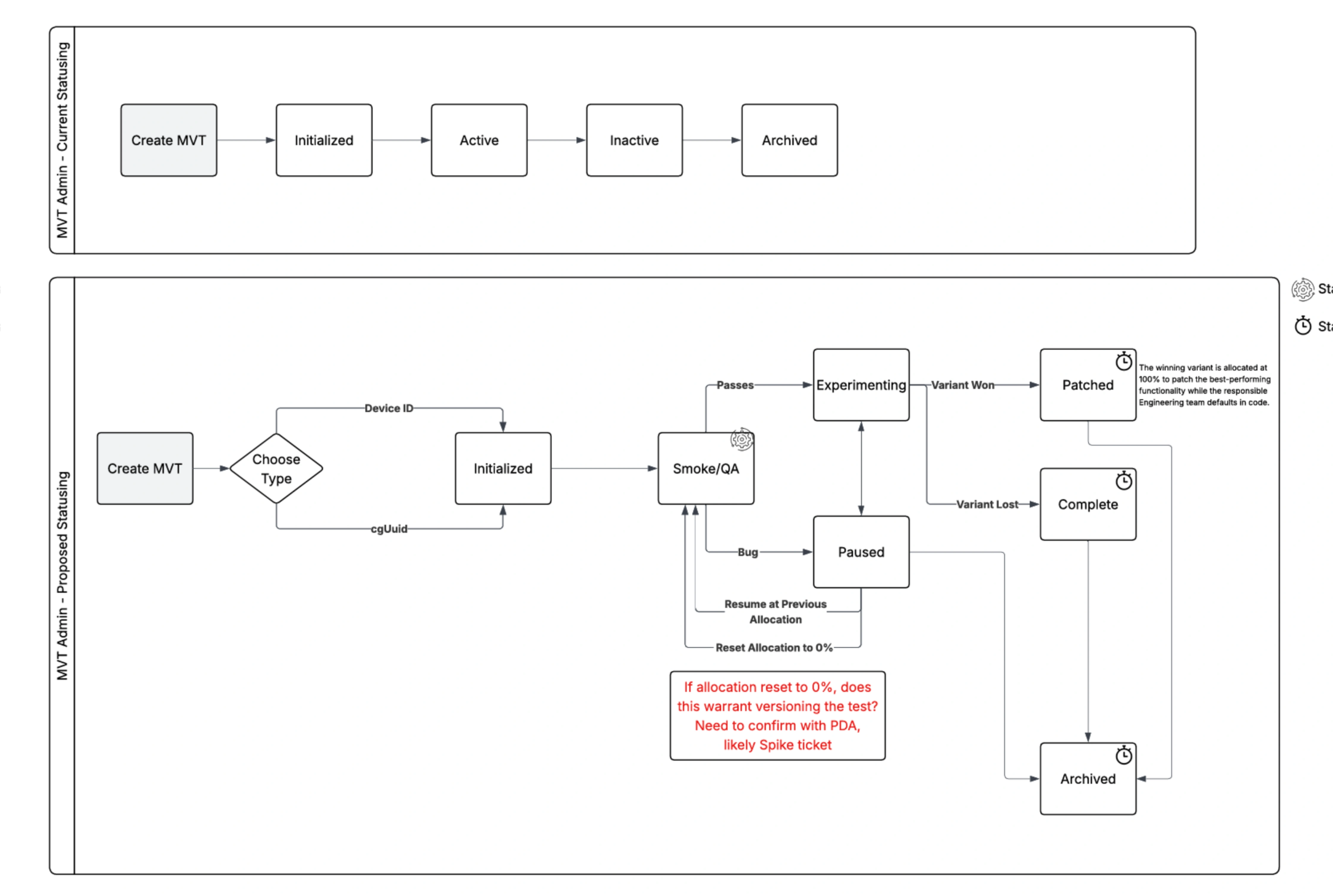
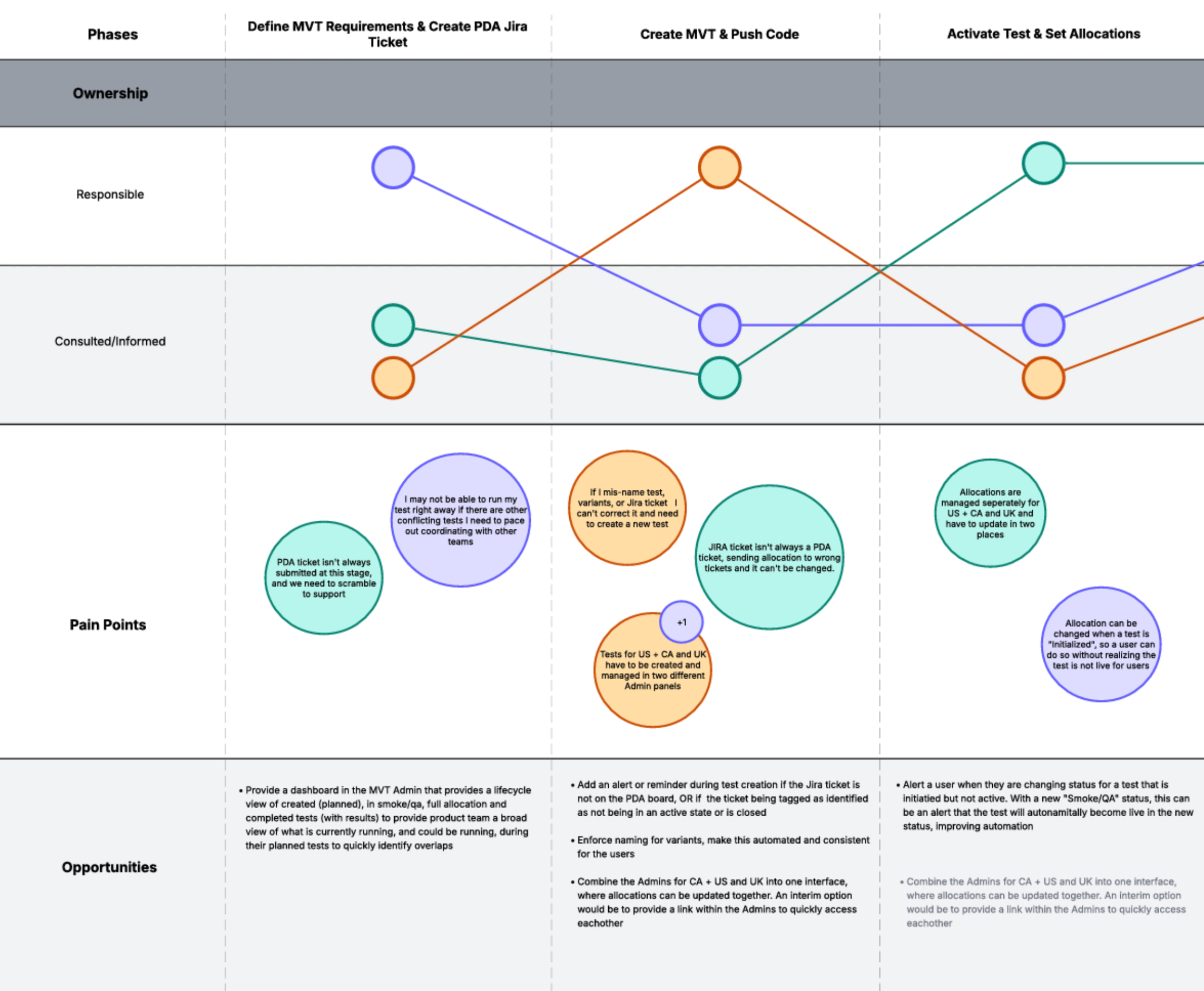
Defined seven statuses in place of the old five, each mapped to a real moment in a test's life, from setup through validation, experimentation, and its final outcome.
Mapped how and when a test moves between statuses, who's responsible, an engineer, analyst, or the system, and how that action shows up in the UI.
Rebuilt the interface around the new workflow so a test's status, and what can happen to it next, is clear without digging into its history.
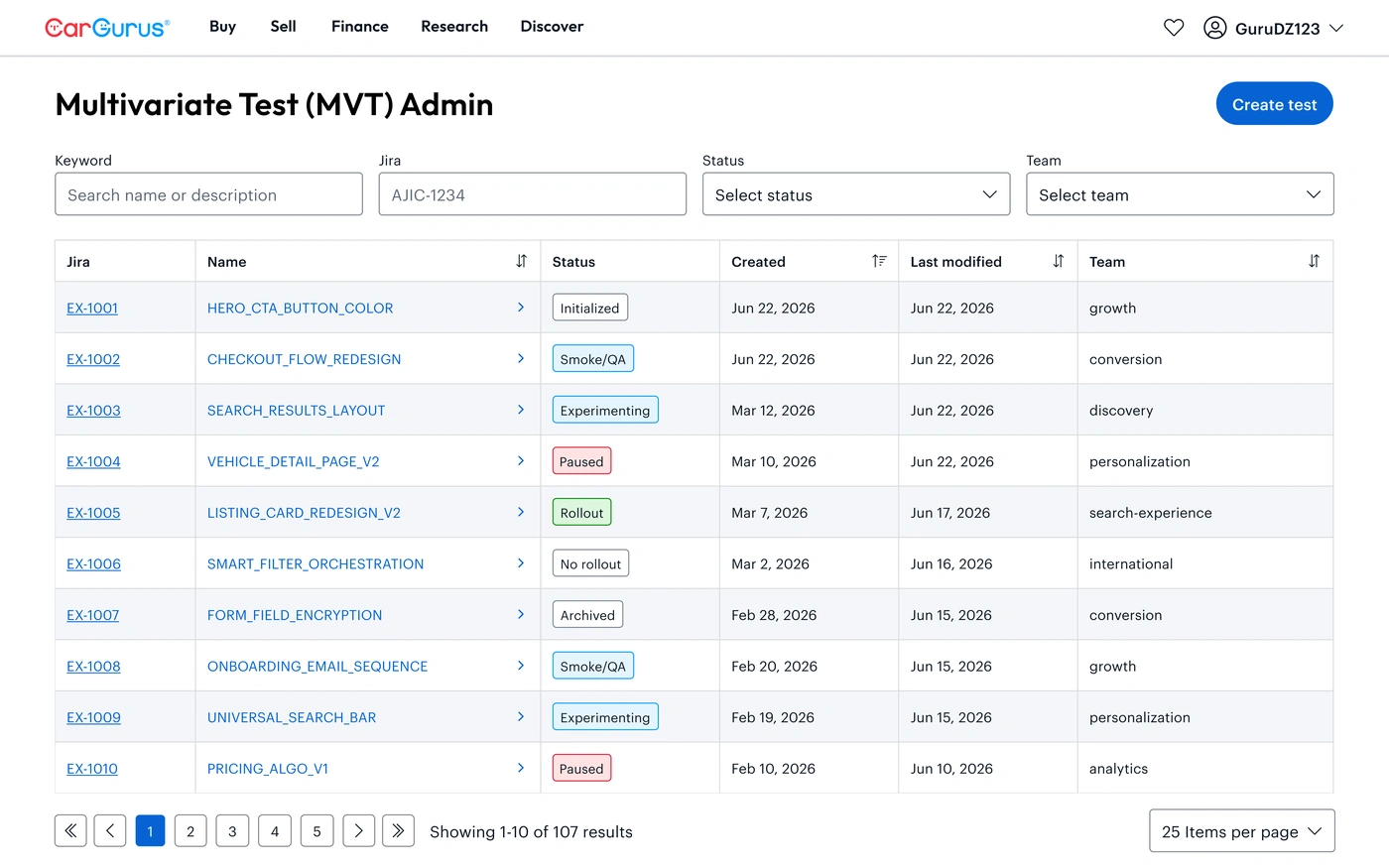
The admin overview is where users go to look up a specific test, so the redesign focused on making it scannable and surfacing the right information in each field.
 Multivariate Test (MVT) Admin
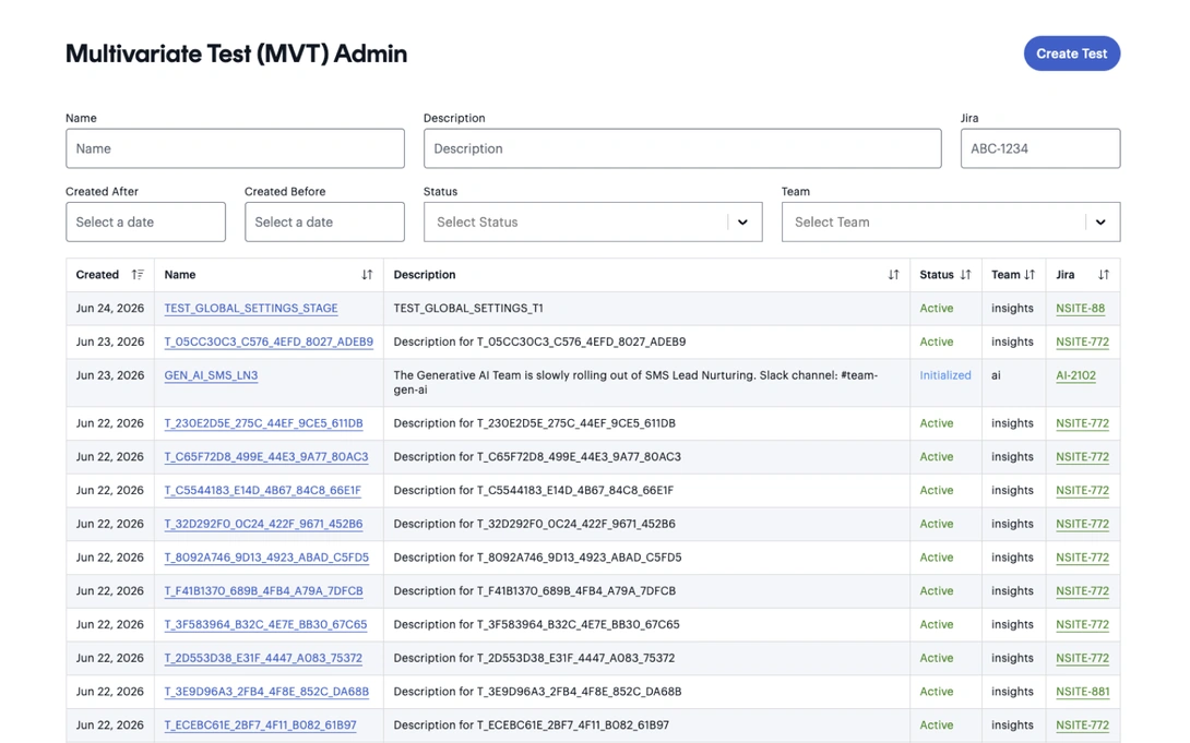 Multivariate Test (MVT) Admin

The old workflow was a straight line that couldn't represent validation, pausing, or a final outcome. The new one adds the states that were missing.
Before this redesign, clicking into a test opened an entirely new page, and country, locale, and device targeting each lived on their own separate page, so switching between them meant losing your place. I consolidated all of it into a single side panel that flies out from the admin table, so opening a test never takes you off the page.
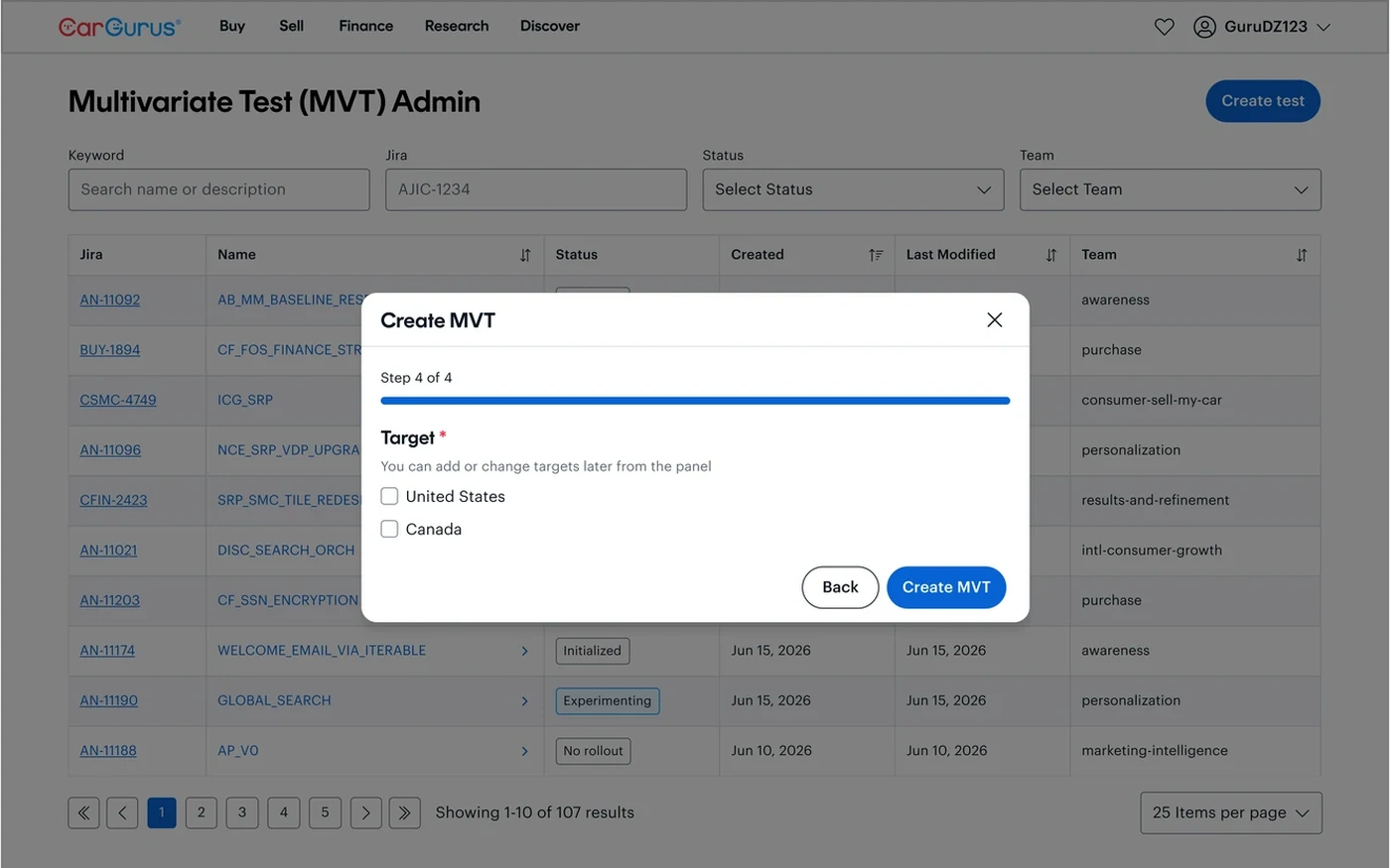
Meeting with the analysts who use this part of the system, I found that around 99% of the time they already know exactly which targets a test needs, so I moved target selection into the test creation flow itself instead of keeping it as a separate step after.
I also restructured the hierarchy so the three live inside one another instead of side by side: tabs are organized per country (United States, Canada), locale is auto-selected from the country, and device-level allocation lives underneath. Analysts can still add a forgotten target, like iOS, at any time.
During workshops, analysts kept comparing this panel to tools like Optimizely, which use sliders for allocation. To match that mental model, we landed on a slider UI that shows allocation at a glance while still letting analysts type in an exact percentage.
An engineer creates the test, starting it at Initialized. An analyst ramps it to a small percentage of traffic, typically 1%, moving it into Smoke/QA to confirm it behaves correctly before anyone relies on its data, then ramps it further into Experimenting once it looks good.
From either Smoke/QA or Experimenting, a test can move into Paused, a status that didn't exist before. Without it, any hold on a test caused data loss and made its results untrustworthy; with it, an analyst can stop a test cleanly without corrupting what's already been collected.
When an analyst has enough signal, the test moves to Rollout if it should go live to everyone, or No Rollout if it shouldn't. Once engineering bakes the outcome into production, the test is moved to Archived and its life in the platform is done.
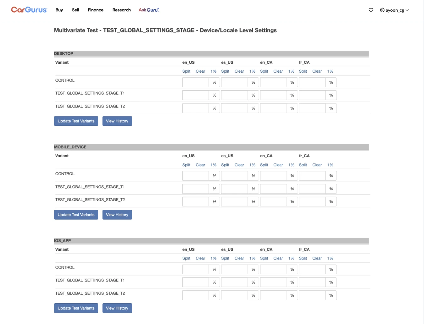 After
After
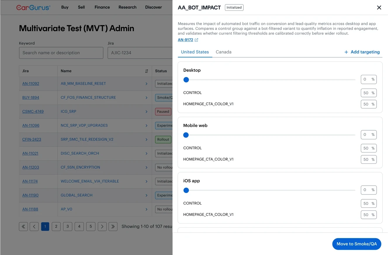 Initialized
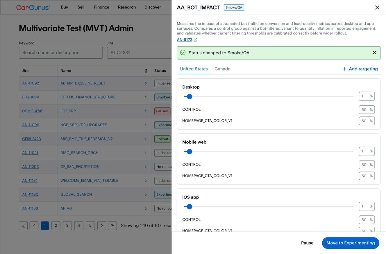 Smoke/QA
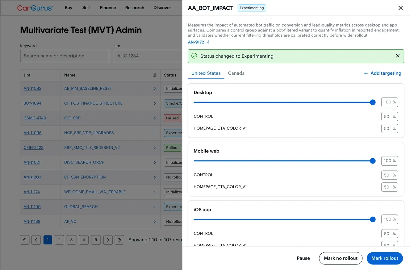 Experimenting
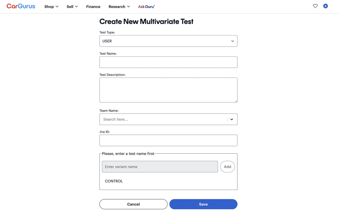
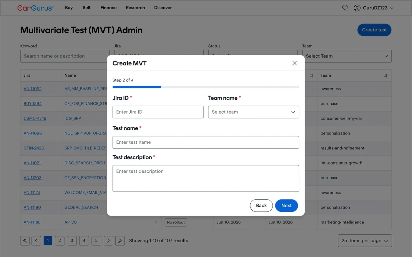
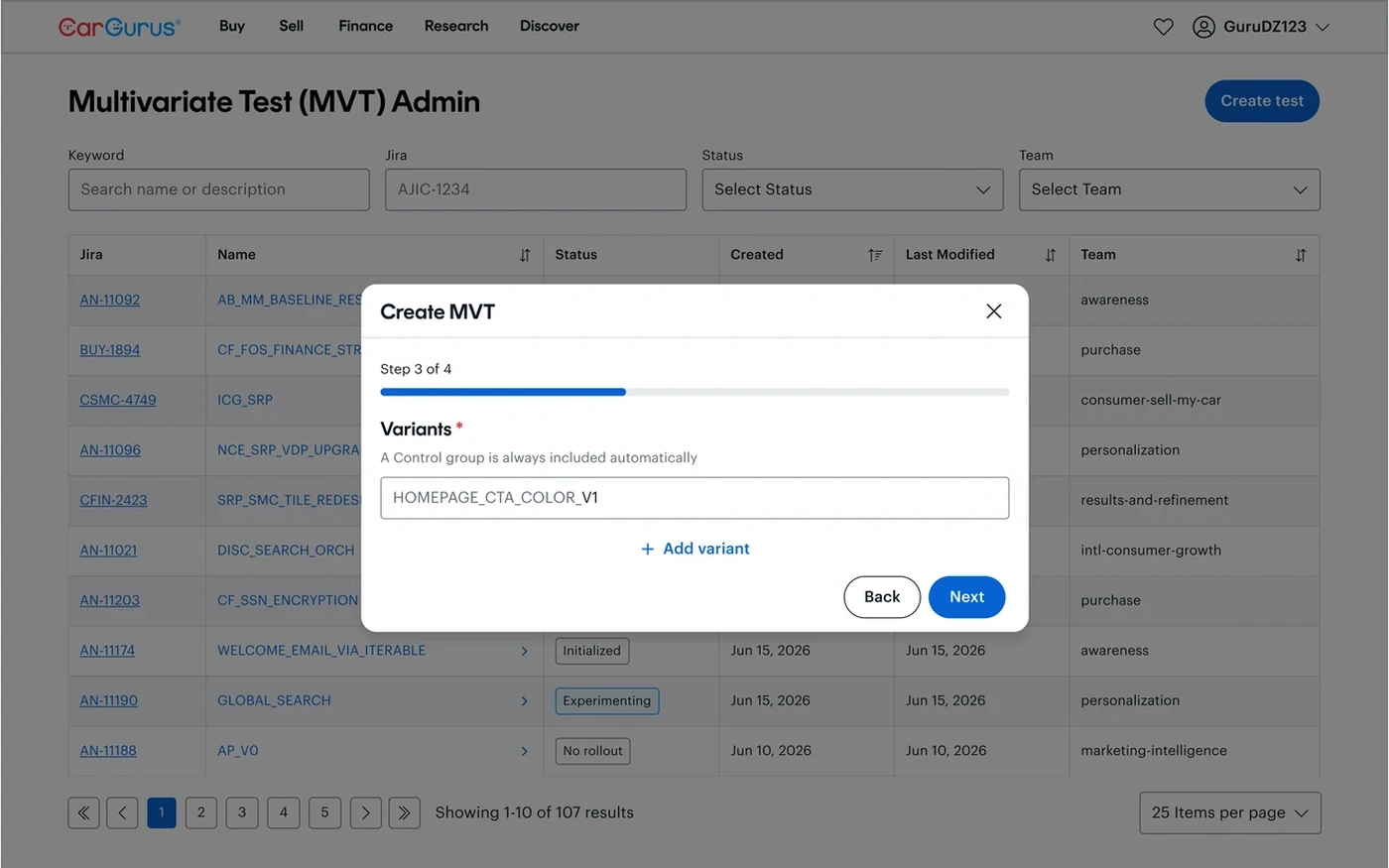
The old form asked for everything at once. The redesign breaks test creation into a guided flow: test type, test details, variants, then target.
Before
Create New Multivariate Test
 Create MVT · Test Type
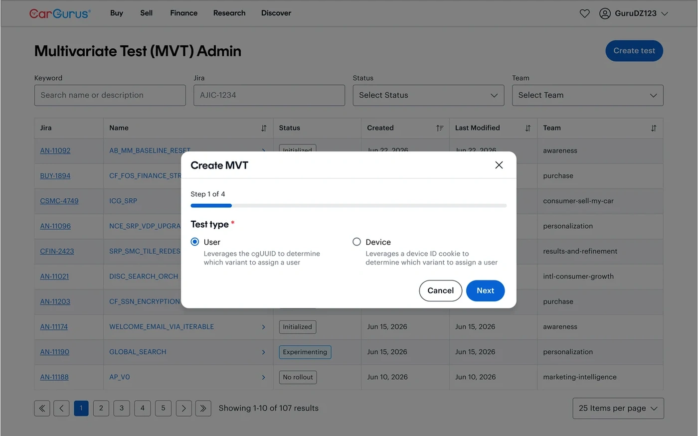 Create MVT · Test Details
 Create MVT · Variants
 Create MVT · Target